/ moviemates
Tiempo de duiracion
Discover movies and series in a personalized and fun way
Join me to explore the case of menuResto, and how from an idea, I designed and created a system where the user was always the protagonist!
MovieMates
Opportunity
Final solutions and design
The Opportunity
I was contacted by Leo, who told to me about her vision “Well, We aim to make a difference, especially by enhancing our service through the integration of technology”. Immediately, I felt very motivated to be part of her idea, because it perfectly represented my vision as a designer: that technology should accompany us and enhance our everyday experience.
The type of system to implement targets a broad range of users with varied technological backgrounds. For this reason, I began by identifying user behaviors and attitudes toward an ordering system through interviews. Participants demonstrated diverse approaches and reactions, which allowed me to recognize patterns, pinpoint issues to resolve, and prevent potential challenges in the system.

📌 These are the issues and comments that were repeated throughout the entire interview.
From the comfort of their table, they will be able to place an order quickly, with the option to track the time, assign a payment method, and, if necessary, call a waiter who will be automatically assigned to the table. The validation of the UX flow, through a Mid-fi prototype, will allow me to optimize the order creation process, improving both satisfaction and the operational efficiency.
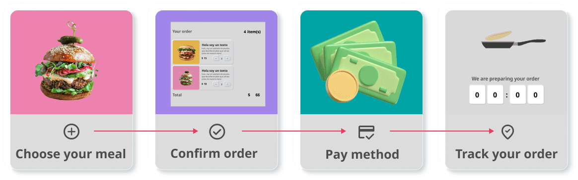
📌The UX flow. In this more visual way, I was able to better explain to the stakeholder the main idea of each point and the path to follow.
So, let's do it!
My design decision was based on creating a concept that provides a positive and smooth experience so that the user can truly enjoy their experience and adopt it as another tool for their day-to-day life.

📌Overview of the design system: Colors, button designs, and some of their states.
I prioritized three key areas :
Menu Clarity: I crafted clear and concise product descriptions to empower users with informed choices.
Accessible Support: I implemented visible and easily accessible help options for immediate assistance whenever needed.
Real-time Order Tracking: I enabled users to track their order status from confirmation to delivery, fostering a sense of control and satisfaction.
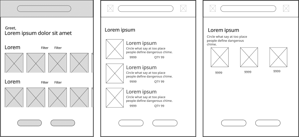
📌Starting the most exciting part! The first wireframes.
Iterate, Learn, Improve: The Essential Cycle
Testing during early design stages helps identify areas for iteration early on. For this reason, in the product roadmap, I scheduled two phases of testing:
Early testing: to avoid accumulating major usability problems that would be expensive to fix in the later stages of the product.
MVP testing: once the product was built, I revisited the users to ensure the solution met both their needs and the business objectives.
Early testing and iterations
To avoid accumulating major usability problems that would be expensive to fix in the later stages of the product, it is crucial to address potential issues early in the design process.
1
Target Size and Hierarchy
This iteration based on Fitts's Law resulted in a significant improvement in the usability. Users were able to locate and interact with cards more quickly and accurately, leading to a more efficient and satisfying user experience.

Impact: This iteration based on Fitts's Law resulted in a significant improvement in the usability.
2
Microinteractions
Touchscreens demand precise finger movements, and microinteractions can guide users' interactions while also offering immediate feedback, instilling trust and confidence in all the different users.

Impact: Error Rate decreased to 1%!!
MVP testing and results
In this second testing stage, I agreed with Leo to test the MVP directly with the restaurant customers to try the app in exchange for a small benefit, such as a discount or free item.
A sample of 30 people with diverse backgrounds, all frequent customers of the restaurant, were selected to conduct this test, yielding the following results:
1
User satisfaction
Out of a sample of 30 users:
22 users gave a 5-star rating – reflecting high satisfaction with the overall experience.
4 users gave a 4-star rating – showing a generally positive response, but with some room for improvement.
4 users gave ratings between 1 and 2 stars – indicating a small percentage of users were dissatisfied.
The majority rated the experience with 5 stars. However, a small percentage of users were dissatisfied. After studying the results in detail, an interesting insight emerged: among those who were dissatisfied were less tech-savvy older adults.
Average
4.5

2%
Less tech-savvy
Through interviews, I learned that their primary concern was a lack of clarity in the ordering process, leading to fears of making unintended confirmations or payments.
To make the system more accessible and user-friendly I implemented an onboarding solution: video that guided users through the ordering process step by step. The video reassured them that no order would be placed or charged until they explicitly confirmed it. This step significantly reduced their anxiety and gave them the confidence to complete their orders.
2
Task completion rate
After analyzing initial results, I identified issues that were preventing users from completing the process efficiently.
Before
70%
Task Completion Rate
After
98%
Task Completion Rate
Impact:
A remarkable 98% of users successfully completed the order placement process, indicating a clear and intuitive interface.
By implementing iterative improvements—such as simplifying the interface, optimizing user flows, and addressing pain points through user feedback—the product's usability significantly improved.
3
Time to complete
Previously, users took an average of 4 minutes and 53 seconds to complete the process, which indicated that the user journey could be inefficient and to contain unnecessary steps.
Before
4:53
Average time
After
2:30
Average time
Improvement Strategy:
The time reduction was achieved by simplifying the user flow, eliminating unnecessary steps, and making key adjustments based on user feedback. Through iterative testing, I identified pain points where users were spending excessive time and worked to resolve those issues.
The average time was an impressive 2 minutes and 30 seconds, demonstrating a user-friendly design that minimizes unnecessary steps.
4
Order tracking usage
After
80%
Users average
Over 80% of users actively utilized the order tracking feature, highlighting its value in enhancing the UX.
Design-to-development hand-off
This project has been a journey of discovery, iteration, and improvement. From understanding the diverse needs of users to creating an intuitive and accessible solution, every step was guided by the goal of enhancing the user experience.
By focusing on clarity, accessibility, and efficiency, the final design not only met but exceeded expectations, as evidenced by a remarkable 98% task completion rate and a significant reduction in order placement time.
User feedback, especially from less tech-savvy individuals, highlighted the importance of empathy-driven design, leading to solutions like onboarding videos that empowered all users to navigate the system confidently. The results demonstrate that listening to users and embracing an iterative approach can transform challenges into opportunities, creating a product that is both functional and delightful.
Try it!
You've just had a long, exhausting but productive day at work. You rush home, eager to grab a bite to eat at your favorite restaurant before it closes. Upon arrival, you settle into a table and realize they're about to close. You start to flag down a waitress the traditional way, but then you notice something new on the table – an ordering system!
Thanks for reading!
This project reflects my passion for designing solutions that truly enhance people's daily lives and is yet another example of how accessibility must be the foundation of any design!