
Home / menuresto
Improving digital order success to 98%: reducing funnel drop-off through iterative UX optimization
Solo Product Designer · Conversion-focused UX · Moderated usability testing · Funnel optimization · Accessibility · Figma
Project
menuResto
Timeline
April - June 2024
Role
Product Designer
Overview
menuResto is a self-ordering web application designed for restaurant customers to place orders directly from their table, eliminating wait times and reducing ordering friction. The concept originated from a real operational pain point: inefficient ordering flows causing lost revenue and poor customer experience in fast-food and casual dining environments.
The design challenge
Self-ordering systems have a hidden conversion problem: they work well for tech-savvy users and fail quietly for everyone else. Designing for the average user would have left a significant portion of the customer base unable to convert undermining the core business case.

Tools & methods
• Figma: UI design, interactive prototype, iterative design
• Moderated usability testing: remote via Google Meet + screen recording
• 30 participants, diverse backgrounds, ages 18–70
• Two testing rounds: conversion funnel validation + post-iteration confirmation
Team
• Product designer (me)
• Developer
• Stakeholder
The problem
Traditional restaurant ordering creates multiple friction points in the customer journey: waiting to be acknowledged, waiting to order, waiting for confirmation. Each step is a potential drop-off point. During peak hours, this friction directly impacts conversion customers leave before ordering.
The business opportunity was clear: a table-side digital ordering system could eliminate these conversion barriers. But the real challenge wasn’t building the feature it was ensuring the funnel worked for the full spectrum of users.
Core tension: a system optimized only for tech-savvy users would create a hidden conversion problem, high drop-off rates from a segment that would never show up in standard analytics because they’d abandon before even starting.
Initial assumptions pointed to a straightforward ordering flow with minimal conversion risk. Two rounds of moderated usability testing proved those assumptions wrong, and revealed the real conversion barrier.

These were the issues and comments that I noticed repeatedly throughout the entire interview.
Research & Discovery
To map the conversion funnel and identify drop-off points, I conducted moderated usability testing with 30 participants across two rounds. The deliberately wide age range, 18 to 70 years old, was a strategic choice to surface conversion barriers that a homogeneous sample would miss.
Testing methodology
✅ Remote moderated sessions via Google Meet observed in real time to capture hesitation, errors, and verbal reasoning at each funnel step
✅ Additional sessions with screen recording for remote participants coordinated with restaurant staff
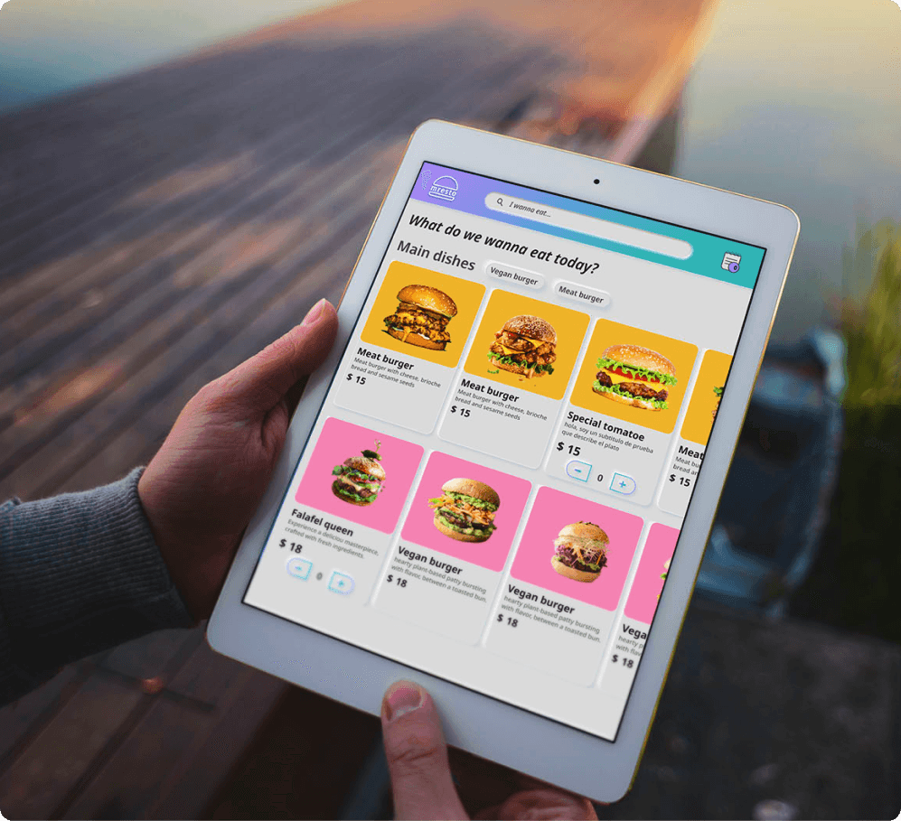
✅ Figma interactive prototype as testing vehicle realistic enough to trigger real conversion behavior
✅ Two rounds: funnel mapping (identify drop-off points) + post-iteration (validate conversion improvement)
Why moderated testing: passive analytics would have shown drop-off rates but not the reason behind them. Understanding the emotional dimension of conversion barriers required direct observation and that’s what surfaced the key insight.
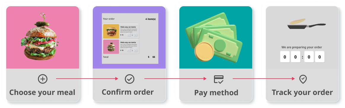
The UX flow. In this more visual way, I was able to better explain to the stakeholder the main idea of each point and the path to follow.
Early funnel results
Most participants completed the ordering flow successfully. However, one segment showed a disproportionately high drop-off rate: less tech-savvy older adults. Their task completion rate was significantly below the overall average and their verbal feedback pointed to something unexpected.
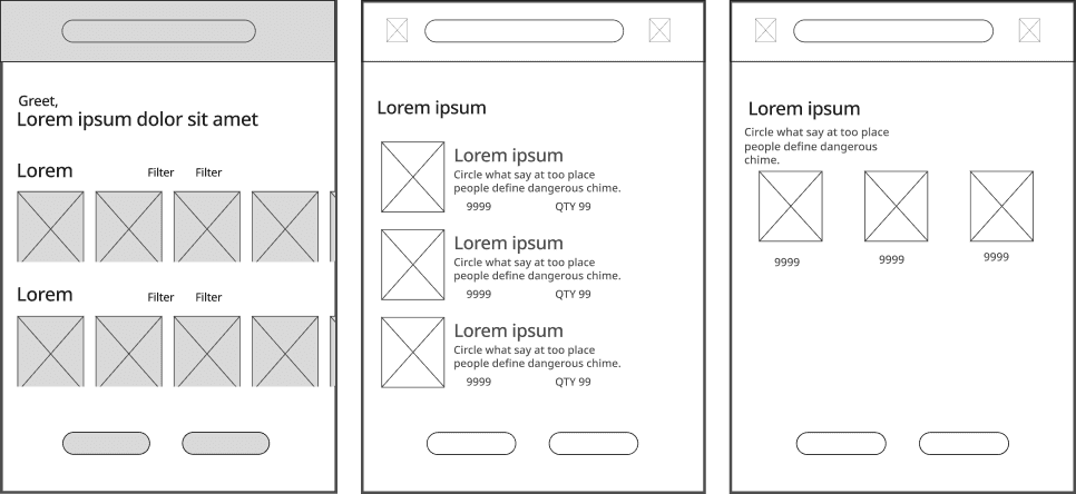
📝 Starting the most exciting part! The first wireframes.
Key Insight: The Hidden Conversion Barrier
Through direct observation and follow-up interviews during the moderated sessions, I identified the root cause of the older users’ funnel abandonment and it wasn’t a navigation problem.
The insight: older users weren’t confused by the interface. They were afraid of making unintended confirmations or payments and that fear was causing funnel abandonment before conversion. A UI fix wouldn’t solve it. A trust intervention would.

Satisfaction data revealed a specific segment with disproportionate drop-off, the trigger for this intervention
This distinction is critical from a CRO perspective. Optimizing the UI would have improved metrics for the general population but left this segment’s conversion rate unchanged. The real lever was addressing the emotional barrier to conversion not the navigational one.

Sketching out diagrams like this helps me break down user experience problems before making improvements. It’s a great way to spot pain points, understand where users get stuck, and fine-tune the design for a smoother experience!
Why this pattern matters beyond this project
Fear of unintended payments is one of the most common hidden conversion barriers in e-commerce, fintech, and any product that handles financial transactions. Identifying it through qualitative research not just quantitative drop-off data, is what makes the difference between a surface fix and a solution that actually moves conversion rates
Iterative Solutions
Based on the funnel analysis and research findings, I ran two design iterations each targeting specific conversion barriers identified in the testing sessions.
Iteration 1
Trust-building onboarding to remove the primary conversion barrier
To address the fear-driven funnel abandonment in the older user segment, I designed a contextual onboarding video guiding users through the ordering process step by step. The key message: no order would be placed or charged until the user explicitly confirmed it.
Adressed
• Removed the primary conversion barrier for the older user segment
• Increased confidence to explore the interface without fear of unintended actions
• Validated in the second testing round: drop-off rate for this segment decreased significantly
Iteration 2
Microinteractions: reducing error rate through interaction feedback
Beyond the trust issue, funnel analysis revealed unnecessary steps adding cognitive load and time to the ordering flow. I simplified the interface, eliminated redundant confirmation steps, and optimized the flow for faster conversion.
Before
After! ✅
Adressed
• Reduced average time-to-convert from 4 minutes 53 seconds to 2 minutes 30 seconds
• Fewer steps reduced misclicks and back-tracking improving funnel efficiency
• Clearer information hierarchy reduced decision fatigue at key conversion points
Iteration 3
Post-conversion feature: order tracking
User feedback indicated uncertainty about order status after submission a post-conversion anxiety point. I designed an order tracking feature to close the loop and reinforce trust. Its 80%+ adoption rate confirmed it addressed a real need, not a nice-to-have.
80%
Users average ✅
Conversion Metrics & Impact
Addressing the right problem made the difference. By targeting the emotional conversion barrier, not just the UI, every metric improved significantly across a diverse sample of 30 users.
Task completion rate
Before
70%
After ✅
98%
Validated across 30 participants, two testing rounds
Time to convert

Achieved by eliminating unnecessary steps in the ordering funnel
The 28% conversion rate improvement is directly attributable to two targeted interventions: the trust-building onboarding (which removed the primary emotional barrier to conversion) and the simplified funnel (which reduced friction for all users). Neither would have been identified without qualitative, moderated research.
Across a diverse sample of 30 participants (ages 18–70), two rounds of iterative usability testing drove conversion rate from 70% to 98%, a 28-point improvement, and cut average time-to-convert nearly in half.
Outcome & Reflection
menuResto demonstrated that conversion optimization and inclusive design aren’t competing priorities, they’re the same thing. By identifying and removing the conversion barrier for the most challenging user segment, the entire funnel improved.
This is the CRO mindset applied to UX: don’t optimize for the average user. Find the segment that’s failing to convert and understand why. The answer usually improves the experience for everyone.
Key deliverables
✅ High-fidelity interactive prototype in Figma
✅ Two-round moderated usability testing: 30 participants, funnel-mapped
✅ Trust-building onboarding intervention, validated conversion impact
✅ Simplified ordering funnel 48% reduction in time-to-convert
✅ Order tracking feature 80%+ adoption confirmed post-launch
What's next?
© 2026 Katherine Martínez - All rights reserved