
Home / petinder online
Two-sided marketplace
Maximizing Search Efficiency Through Filter Validation
End-to-end product design · Usability testing · Scalable design system · Cross-functional team · Figma · A/B testing
Project
Petinder.online
Timeline
May – Nov 2024
Role
Product Designer
Overview
Petinder is a web platform connecting pet adopters with animal shelters and rescue organizations.
The core challenge wasn’t visual, it was structural: how do you design a search experience for a user who doesn’t know exactly what they want, while simultaneously giving shelters an efficient system to keep listings updated?
As a Product Designer on a cross-functional team (PM, 2 devs, 3 designers), I owned the end-to-end UX, from defining information architecture to delivering developer handoff documentation.

Tools & Methods
• Figma: UI design, prototyping, scalable design system, components
• Maze: unmoderated usability testing, A/B study (n=7)
• Iterative design process across 6-month timeline
• Developer handoff documentation + interaction specs
Team
• 1 Product Manager
• 3 UI/UX Designer
• 1 Stakeholder (Founder)
The problem
The pet adoption space has a discoverability problem. Most platforms either overwhelm users with filters they don’t know how to use, or offer so little filtering that results feel irrelevant.
Our specific challenge: users didn’t arrive with a clear mental model of what pet they wanted, they were browsing emotionally, not transactionally.
Design tension: too many filters = cognitive overload. Too few = frustrating, irrelevant results. Finding the right balance was the core design problem.
Most platforms either overwhelm users with at the same time, the platform needed to serve a second user type: shelters, with a completely different set of needs: managing listings efficiently, keeping profiles updated, and maintaining visual consistency across posts.
My Approach: Two POVs, One System
I structured the project around two distinct points of view: the adopter and the shelter admin. Because designing for both simultaneously would have created unnecessary friction.
POV 1: adopter
Priority: speed and emotional resonance.
Key design decisions:
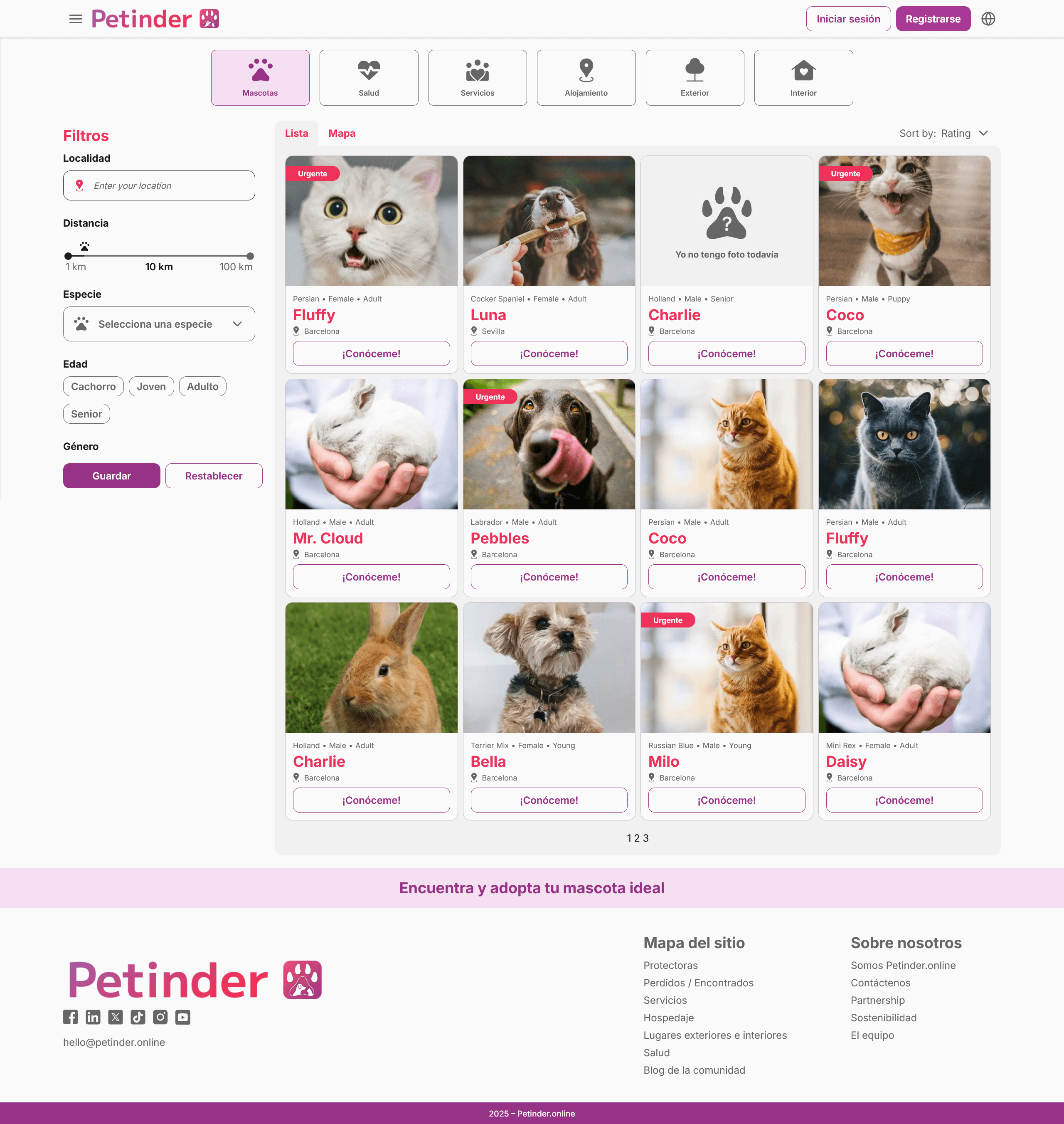
• Advanced filter system by species, age, size, and personality validated through usability testing
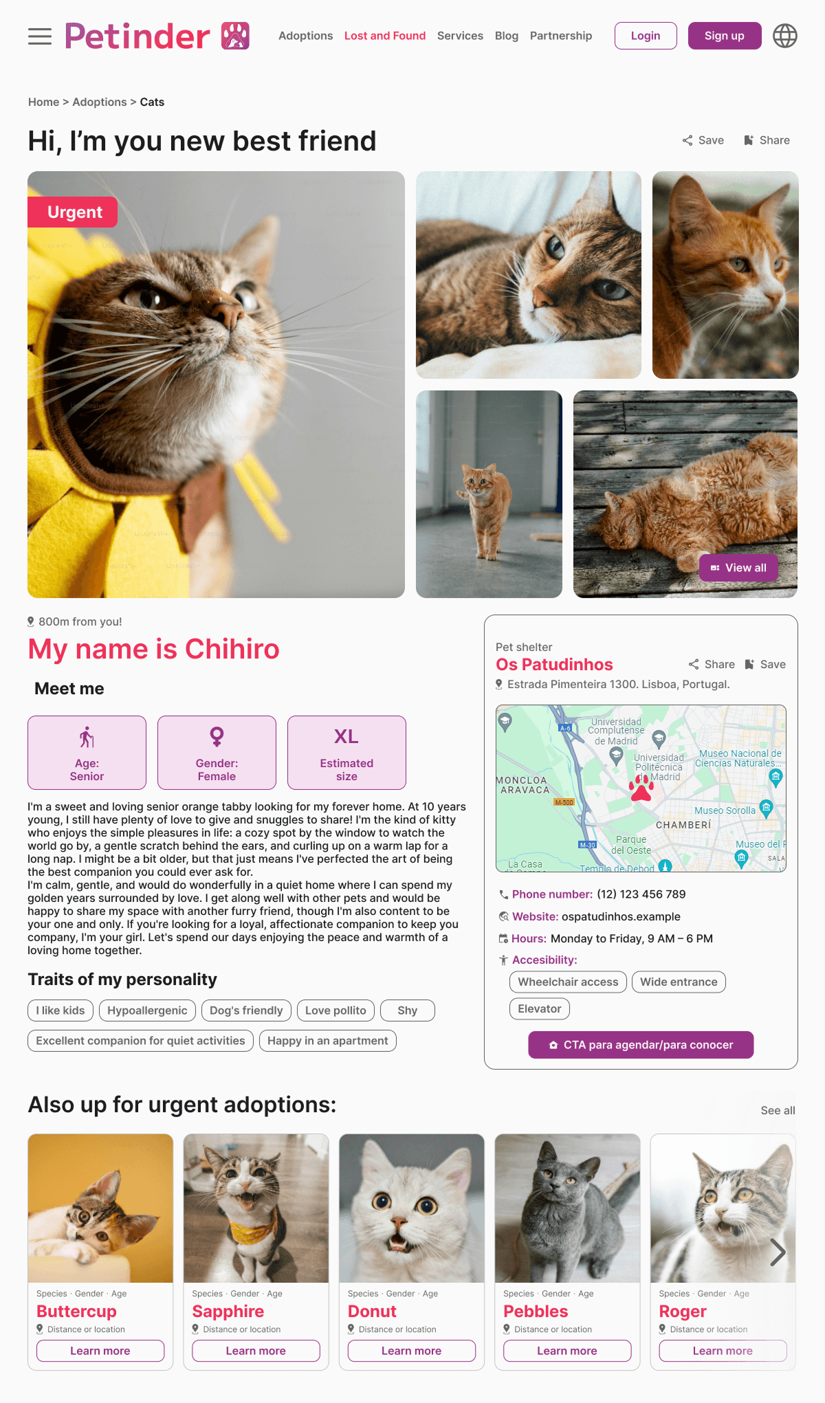
• Pet profile cards surfacing key information immediately
• Structured navigation from pet selection to shelter contact
• Accessible CTAs to reduce friction in the adoption flow
POV 2: shelter
Priority: efficiency and control
Key design decisions:
• Scalable upload form with predefined fields to streamline listing creation
• Consistent profile format enabling easy comparison across pets
• Edit and update functionality without recreating listings from scratch
Core Challenge: Usability Testing the Filter System
Validated via unmoderated usability testing (Maze, n=7); the sidebar filter reduced task friction and kept users oriented the modal created a context-switching cost that slowed down navigation.
The filter system was the highest-stakes design decision in the project. After mapping the adopter flow, we identified the search-to-match step as the highest potential drop-off point: if users couldn’t find a relevant pet quickly, they’d leave.

Option A: Sidebar filter (persistent)
• Always visible alongside results
• Real-time result updates as filters are applied
• User maintains visual context throughout the interaction
Option B: Modal filter (overlay)
• Triggered on demand, full-screen interaction
• Results only visible after closing the modal
• Requires context switch on every filter adjustment
Why these two specifically: they represent opposite ends of a key UX tradeoff: context preservation (sidebar) vs. focused attention (modal). This is a product decision, not a visual preference.
Usability test findings, why the sidebar won:
✅ Accessibility: filter remained visible at all times, no open/close interaction needed
✅ Efficiency: users applied filters and saw results instantly, without losing context
✅ Orientation: the modal blocked the view and created unnecessary steps
The iterative testing process confirmed the sidebar reduced task friction across all 7 participants
What I'd do differently
On mobile, a persistent sidebar creates real estate constraints. A future iteration would explore a collapsed/expandable filter bar for smaller viewports, preserving the context-preservation benefit while adapting to screen size.
Scalable Design System
In parallel to the feature work, I collaborated with the team to build a scalable design system in Figma. This was a structural decision made early, not an afterthought, to ensure visual and functional consistency across both user flows.
Components and tokens defined
✅ Typography scale for readability and visual hierarchy
✅ Color tokens aligned with product identity and emotional tone
✅ Reusable components: buttons, cards, forms, tags, and navigation elements
✅ Interaction patterns ensuring usability consistency across all screens
The scalable component library enabled the development team to work from standardized specs, reducing implementation errors during handoff and allowing iterative improvements without compromising design integrity.
Impact
Standardized components reduced the need for one-off design decisions during development, enabling faster and more consistent iteration.


Voices from the project
November 2024
Kathrine is just an amazing person. Her contribution to Petinder's new website has been crucial. She has been running the whole UX/UI part of it and also making sure that rest of the team members would be perfectly aligned. For sure I would recommend Kathrine to any new projects she's being considered for.

Meelis Paloson
Founder at Petinder.online
”
What's next?
Check menuResto!
© 2026 Katherine Martínez - All rights reserved